DAZZLING
DIANA
DESIGN
Glimpse.me app
Glimpse is an online content subscription based platform that makes it easy for content creators to receive funding from fans for their digital creations. Content creators can upload different types of content such as photos, videos, and files. The platform also supports live video streaming and timed one-on-one private video calls between creators and fans.

Problem
App development without UX/UI guidance for over 2+ years.
Confusing UX, lack of structure, default FE, outdated UI, no design system...

Discovering usability issues and complete UX rework of main features following the best UX practices.
UI rework using familiar design systems.
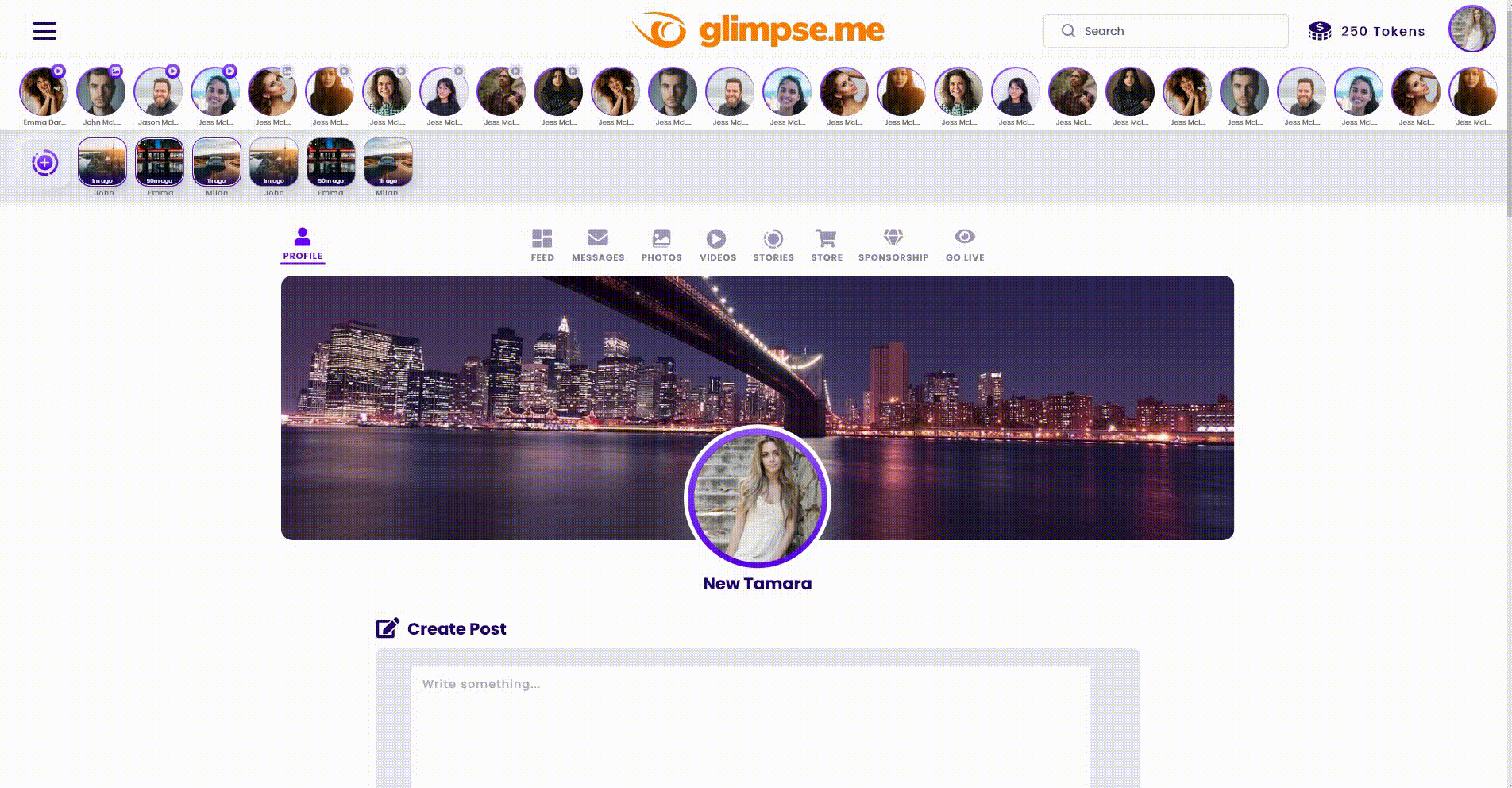
UX rework of most important feature: Navigation and Activity feed. New filters for content type added for easier scanning of content.
New Activity feed
Solution

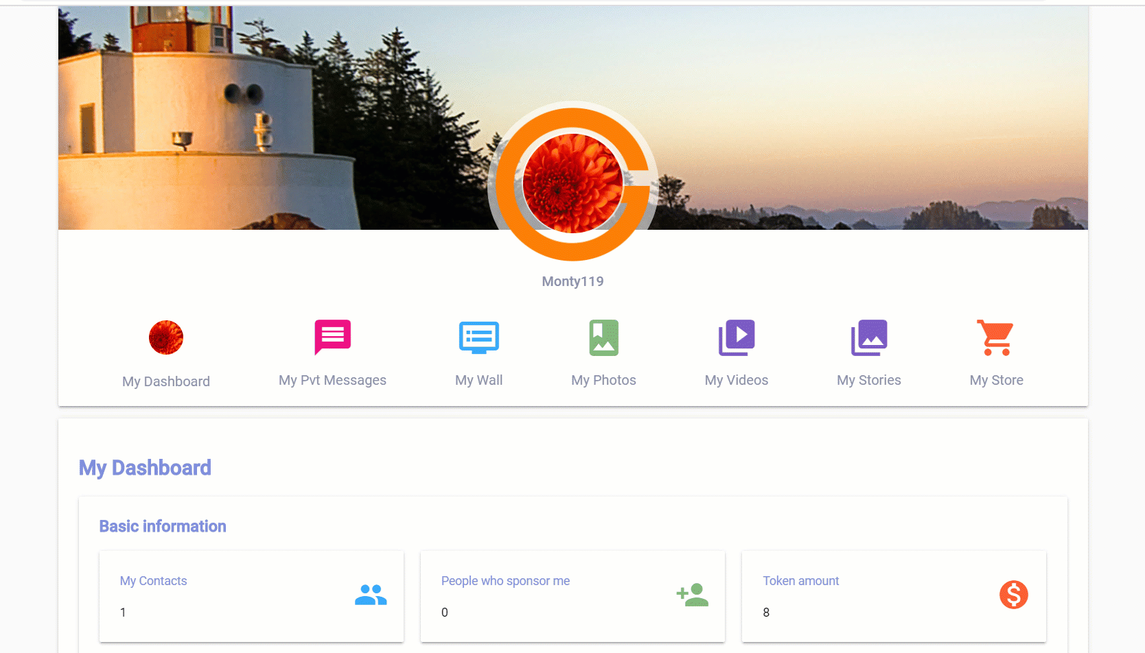
New My profile page
My Profile is a redesign project created by a team of developers and me as a designer to make it easier for Users to navigate different screens and reduce confusion between "Creator" and "Viewer" role. Ultimately a better user experience was created.

Problem
Old design
Long and confusing sign up process, no design consistency, no branding or professional design touch, onboarding of new users usually ended before account is created.
Solution
Team launched a suite of projects which included revamping the landing page, easier onboarding, and making signing up for online accounts easier and more efficient. These projects and redesign simplified the confusing and long sign up process, presented a new onboarding experience, and ultimately made it easier to get more users aboard.
New Landing Page
By revamping the landing page we brought the brand and design closer to the gaming industry (target audience). All visuals were created in collaboration with Marketing team following their campaign, as well as creative direction from my side.


Sign Up
In today's fast paced world, nobody likes to fill out long forms.
The Sign Up process is simplified, elements are clear, space is decluttered and free of unnecessary elements.
Micro-interactions added. Headline points out benefits.
Sign Up page is more brand oriented, corresponds well with landing page. Wording is changed to suit better voice of the application.

We added:
Welcome Messages
Product Tours
Progress Bars
Cheklists
Onboarding Tootips
Empty States
Onboarding

New onboarding UX resolved product bumpers and helped the User successfully onboard. Empty states, welcome messages, and product tours giving Users the best overview of app features and experience possible.
Shoutouts


Some of the feedbacks I've received working on this projects from stakeholders and colleagues.
